How I Vibe-Coded My First Web App: babytracker.in
babytracker.in was built by starting with hand-drawn sketches for every key screen, then translating those ideas directly into code. Here’s a look at how each major page evolved from paper to a working web app.
Home Screen
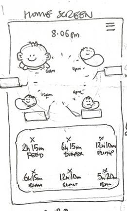
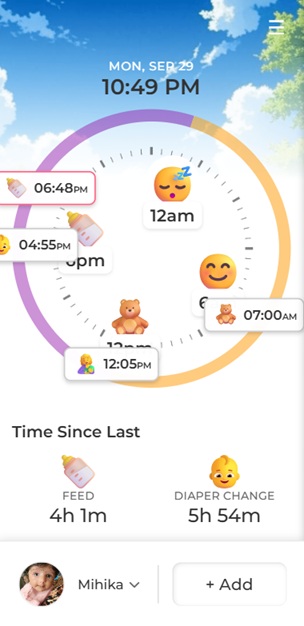
The Home screen gives a quick overview of the baby’s day, showing activity icons around a clock and time since last feed, diaper, or pump. The sketch mapped out the layout, which was faithfully recreated in the app.
Timeline
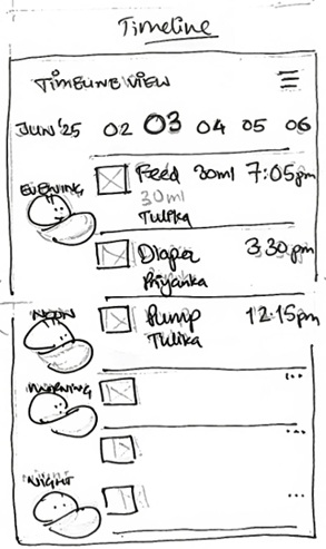
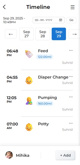
The Timeline page lets parents see a chronological list of all activities, with icons, times, and details. The design makes it easy to review the day at a glance.
Statistics
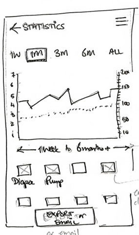
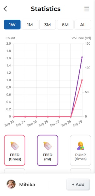
The Statistics page visualizes trends in feeding, diaper changes, and pumping over time. The sketch guided the layout for charts and quick filters.
Profile
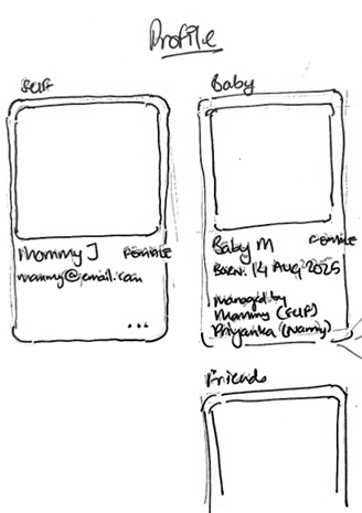
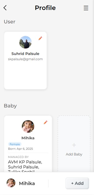
The Profile page manages user and baby details. The hand-drawn design made it easy to plan the card layout and information hierarchy.
Other Key Flows
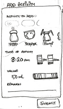
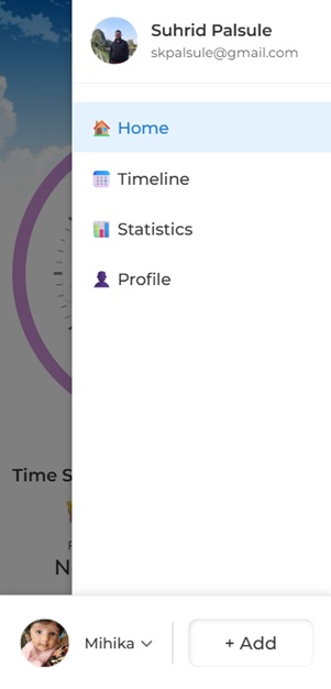
The Add Activity flow and sidebar navigation were also sketched out first, ensuring a smooth experience for parents adding new entries or switching between pages.
Lessons Learned
- Sketching each page first made the coding process much faster and more focused.
- Pairing sketches and screenshots helped keep the "vibe" consistent from idea to implementation.
- Iterating visually before building saved time and led to a better product.
babytracker.in is now live and in use, helping parents track their baby’s daily activities with ease. This project was a great reminder that sometimes, the best way to start is with a pencil and paper!